Skip to content
 Color is a powerful tool that can completely transform the look and feel of your home. From creating a cozy and inviting atmosphere to making a bold design statement, the colors you choose play a crucial role in shaping the overall aesthetic and mood of your space. In this guide, we will explore the importance of color in home design and provide you with practical tips on choosing the right color palette for your home.
Color has the ability to evoke emotions, stimulate the senses, and enhance the functionality of a room. The right color choices can make a small space appear larger, bring warmth to a cold room, or add a touch of elegance to a simple design. By understanding the principles of color theory and considering factors such as room function, lighting, and personal preferences, you can create a harmonious and visually appealing environment that reflects your unique style.
Not only does color have a direct impact on aesthetics, but it can also influence our psychological well-being. Certain colors have been associated with specific moods and emotions. For example, cool blues and greens can promote a sense of calmness and relaxation, while vibrant yellows and oranges can create a lively and energetic atmosphere. By carefully selecting colors that align with the desired mood and purpose of each room, you can enhance the overall comfort and functionality of your living spaces.
In this guide, we will delve into the world of color theory, helping you understand the basics of how colors interact and complement each other. We will discuss the difference between warm and cool colors, the significance of lighting in color perception, and the art of creating a balanced color palette. We will also provide you with practical tips on harmonizing colors with existing elements in your home, testing color combinations, and considering the psychological impact of different hues.
Considering Room Function: How to Select Colors Based on Room Purpose
Each room in your home serves a specific purpose, and the colors you choose should align with that purpose to create a harmonious and functional space. Here’s how you can select colors based on the function of each room:
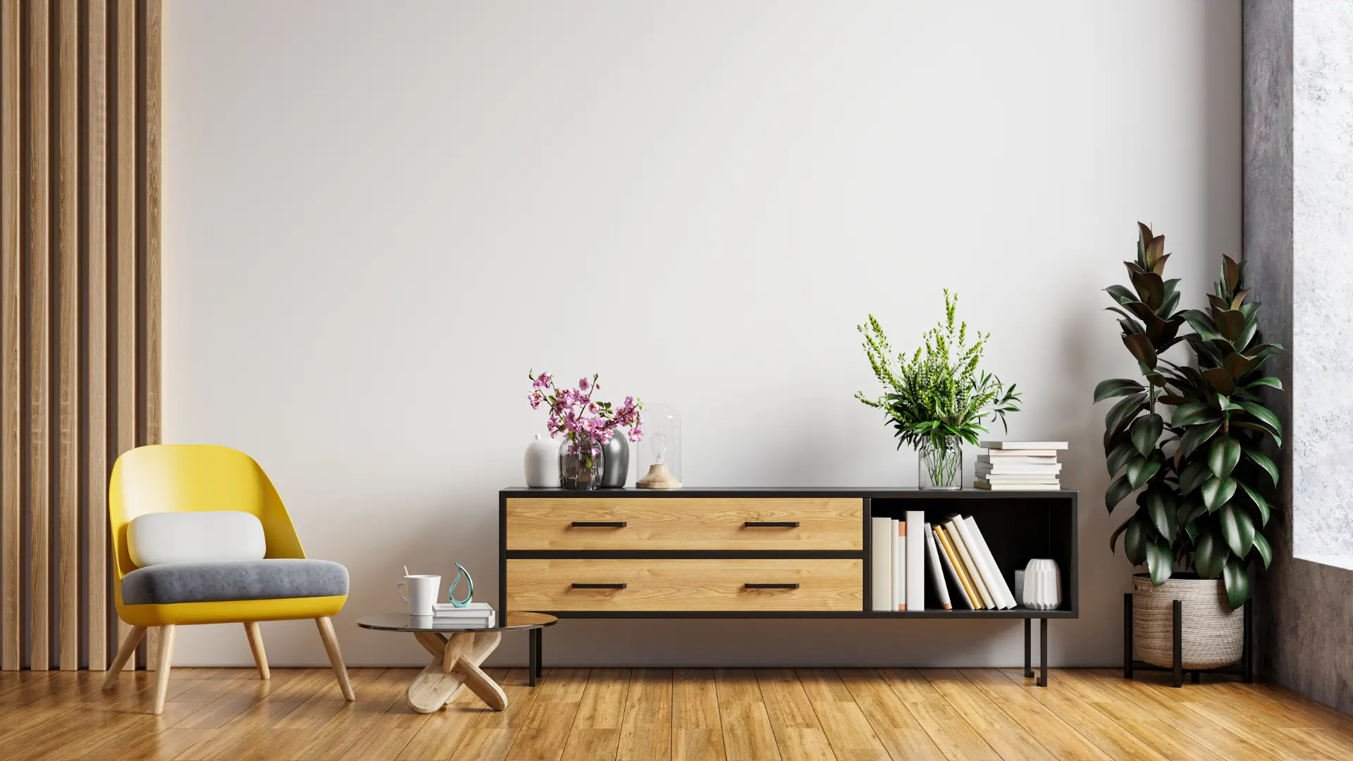
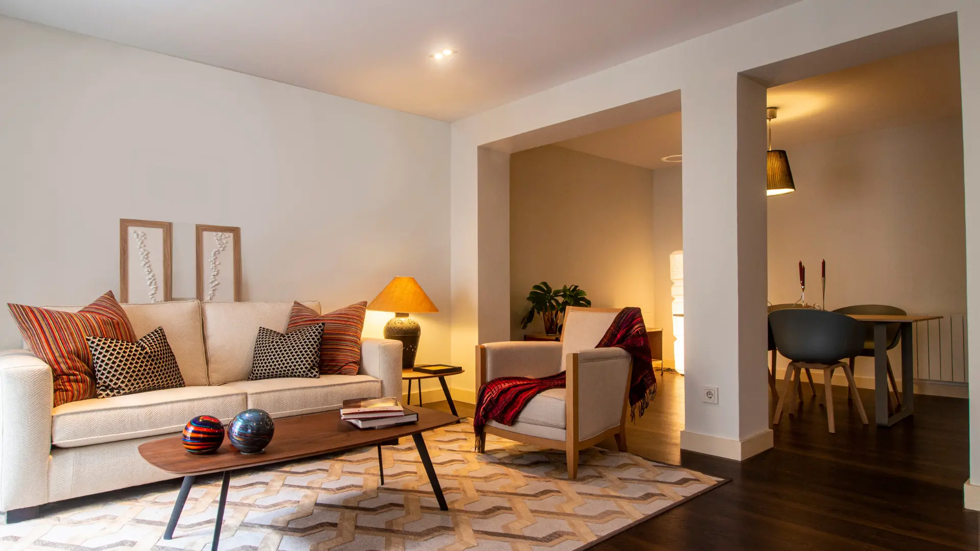
- Living Room: The living room is often a space for relaxation and socializing. Consider using warm and inviting colors such as earthy tones, soft neutrals, or soothing pastels. These colors can promote a cozy and comfortable atmosphere, making it an ideal place for unwinding and connecting with family and friends.
- Kitchen: In the kitchen, where culinary delights come to life, it’s essential to create a vibrant and energizing ambiance. Consider incorporating bold and refreshing colors such as vibrant greens, sunny yellows, or crisp whites. These colors can stimulate appetite and create a lively environment that enhances the cooking and dining experience.
- Bedroom: The bedroom should be a sanctuary for rest and relaxation. Opt for calming and serene colors such as cool blues, soft grays, or gentle lavender. These colors can promote a peaceful atmosphere, helping you unwind and achieve a good night’s sleep.
- Home Office: Productivity and focus are key in a home office. Consider choosing colors that inspire concentration and creativity, such as muted greens, warm neutrals, or energizing yellows. These colors can help create a conducive work environment and boost productivity.
- Bathroom: Bathrooms can benefit from colors that promote a sense of freshness and cleanliness. Shades of white, soft blues, or light greens can create a spa-like atmosphere and make your bathroom feel like a serene retreat.

Creating a Mood: Using Colors to Evoke Specific Moods and Emotions
Colors have the remarkable ability to influence our mood and emotions. By understanding the psychological impact of different hues, you can use colors strategically to create the desired atmosphere in each room. Here are some common color associations and the moods they can evoke:
- Blue: Blue is often associated with calmness, serenity, and relaxation. It can create a tranquil and peaceful environment, making it suitable for bedrooms, bathrooms, and spaces where you want to promote a sense of calm.
- Red: Red is a bold and energetic color that can evoke passion, excitement, and stimulation. It can be used as an accent color in spaces where you want to create a lively and vibrant atmosphere, such as dining areas or entertainment rooms.
- Green: Green represents nature and can bring a sense of balance, harmony, and renewal to a space. It can be used in various rooms, especially areas where you want to create a connection with the outdoors, such as living rooms or home offices.
- Yellow: Yellow is a cheerful and uplifting color that can promote happiness, optimism, and creativity. It can be used to add warmth and energy to spaces like kitchens, playrooms, or creative studios.
- Neutrals: Neutral colors like whites, grays, and beiges can create a sense of versatility, elegance, and timelessness. They provide a neutral backdrop that allows other colors and elements to stand out. Neutrals are often used as a base color in any room.
When selecting colors to evoke specific moods, consider the function of the room, the desired atmosphere, and your personal preferences. Experiment with different shades and combinations to find the perfect color palette that resonates with you and enhances the overall mood and ambiance of your space.

Harmonizing with Existing Elements: Tips for Coordinating Colors with Furniture and Decor
When choosing colors for your home, it’s important to consider the existing elements such as furniture, flooring, and decor. Here are some tips for coordinating colors and creating a cohesive look:
- Consider the Undertones: Pay attention to the undertones of existing elements. For example, if your furniture has warm undertones, opt for colors with complementary warm undertones to create a harmonious blend. Similarly, if you have cool-toned furniture, choose colors with cool undertones.
- Create Contrast: Incorporate contrast to make your furniture and decor stand out. If you have neutral or light-colored furniture, consider using bolder or darker shades on the walls to create a striking contrast. Conversely, if you have vibrant or bold furniture, consider using more muted or neutral colors on the walls to allow the furniture to take center stage.
- Use a Color Wheel: Refer to a color wheel to find complementary or analogous colors. Complementary colors are opposite each other on the wheel and create a vibrant contrast, while analogous colors are adjacent to each other and offer a more harmonious blend. Use these color relationships to guide your choices and create a balanced and visually pleasing color palette.
- Patterns and Textures: If your furniture or decor features bold patterns or textures, choose colors that complement or enhance those patterns. Consider pulling colors from the patterns or using neutral colors that allow the patterns to shine.
- Test Swatches: Before committing to a color scheme, test swatches of paint against your furniture and decor to see how they interact. Natural and artificial lighting can affect how colors appear, so observe them in different lighting conditions to ensure the desired effect.
Lighting and Color: The Impact of Lighting on Color Perception
Lighting plays a crucial role in how colors are perceived within a space. Here’s how lighting can influence color:
- Natural Light: Natural light can bring out the truest representation of color. Consider the orientation of your space and how natural light enters throughout the day. Colors can appear different depending on the direction and intensity of sunlight. Test paint swatches at different times to see how they look under varying natural light conditions.
- Artificial Lighting: Different types of artificial lighting, such as warm incandescent bulbs or cool white LEDs, can have varying color temperatures. This affects how colors appear in a room. Experiment with different lighting options to find the right balance that enhances the colors you’ve chosen.
- Layering Light: Layering lighting sources, such as using ambient, task, and accent lighting, can create depth and dimension. It can highlight certain colors and create a desired mood. Consider using different lighting fixtures strategically to enhance the colors in your space.
- Dimmers: Installing dimmer switches allows you to adjust the intensity of artificial lighting. This gives you control over the ambiance and can affect how colors are perceived. Dimming the lights can create a more intimate and cozy atmosphere.
Remember, lighting conditions can significantly impact the appearance of colors. Take time to observe how colors interact with different lighting sources before finalizing your choices. By coordinating colors with existing elements and considering the lighting in your space, you can create a harmonious and visually stunning environment that truly showcases your personal style.
As you navigate the process of selecting a color palette for your home, here are some additional tips and considerations to keep in mind:
- Sample and Test Colors: Always test your chosen colors before committing to a full application. Paint small swatches on the walls and observe them in different lighting conditions throughout the day. This will help you see how the colors appear and ensure they meet your expectations.
- Consider the Size of the Space: Keep in mind that colors can visually impact the perception of space. Lighter colors tend to make a room feel more spacious, while darker colors can create a cozy and intimate atmosphere. Consider the size and natural lighting of each room when deciding on the color palette.
- Cohesion and Flow: Aim for a sense of cohesion and flow as you move from room to room. While you can experiment with different color schemes, it’s important to maintain a sense of visual harmony throughout your home. Consider using complementary or analogous color palettes that share common elements to create a cohesive look.
- Take Inspiration from Your Surroundings: Look to your environment for inspiration. Consider the colors of nature, artwork, or even the architectural features of your home. Drawing inspiration from your surroundings can help you create a color palette that feels connected and integrated with your overall space.
- Personal Preference and Longevity: Ultimately, choose colors that resonate with your personal style and preferences. Trends come and go, so it’s important to select colors that you can live with and enjoy for an extended period. Choose timeless hues that will stand the test of time and provide a backdrop for your evolving decor choices.
- Seek Professional Advice: If you feel overwhelmed or unsure about color choices, don’t hesitate to consult with a professional interior designer. They can provide valuable insights, offer personalized recommendations, and help you create a cohesive color palette that aligns with your vision.
Remember, selecting a color palette for your home is a creative process that should reflect your personal taste and create an atmosphere that brings you joy. Trust your instincts, be open to experimentation, and enjoy the journey of transforming your space with the power of color.